Project Overview:
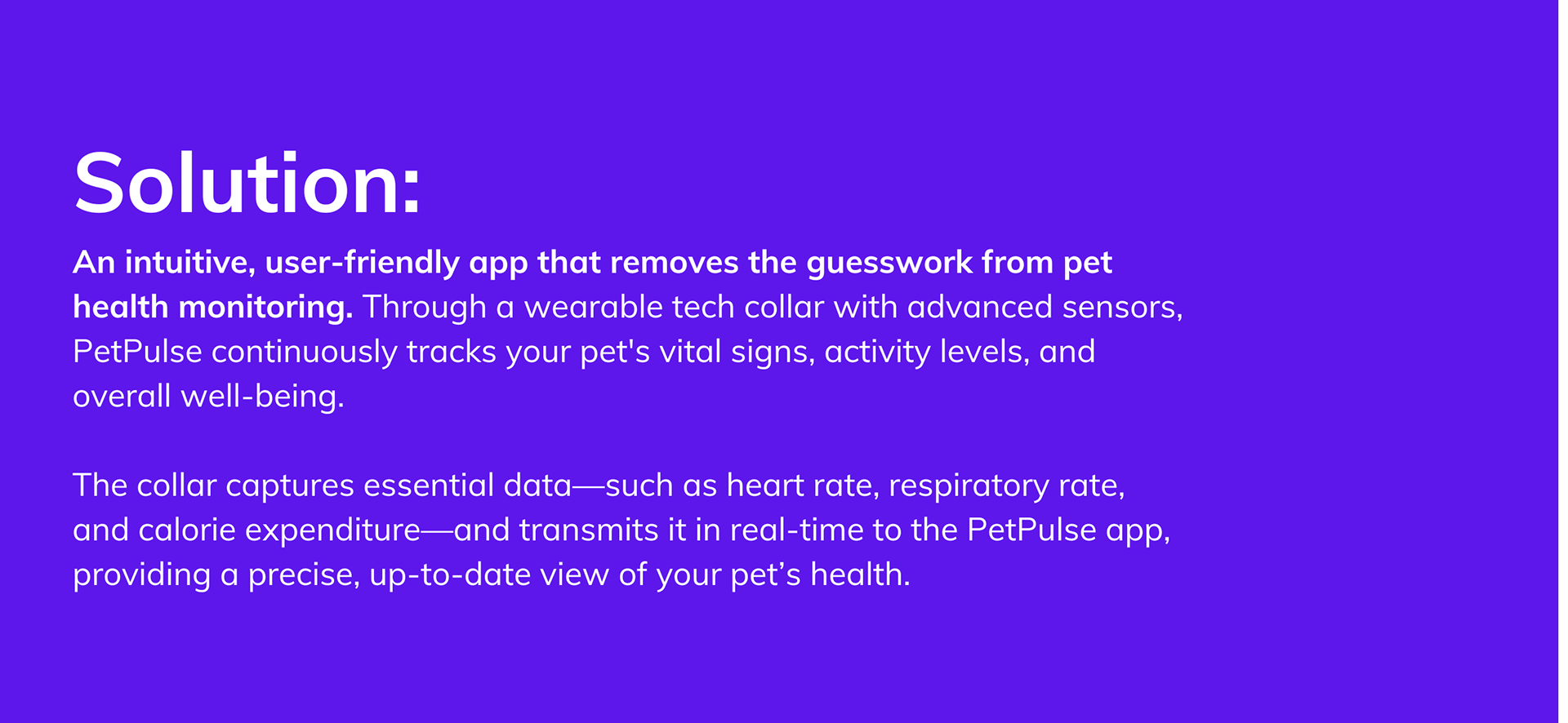
Pet Pulse is a solo project I developed during my second semester—a pet health-tracking app paired with a wearable tech collar designed to ensure the well-being and safety of furry companions. It combines cutting-edge technology with user-friendly features to deliver comprehensive health monitoring and personalized insights for pets.
Role: UX Research, UX/UI Designer
Project Type: App Design
Tool Used: Photoshop, Illustrator, Maze, Survey Monkey, Figma, Miro
Timeline: Sept-Dec 2022
Primary Research:
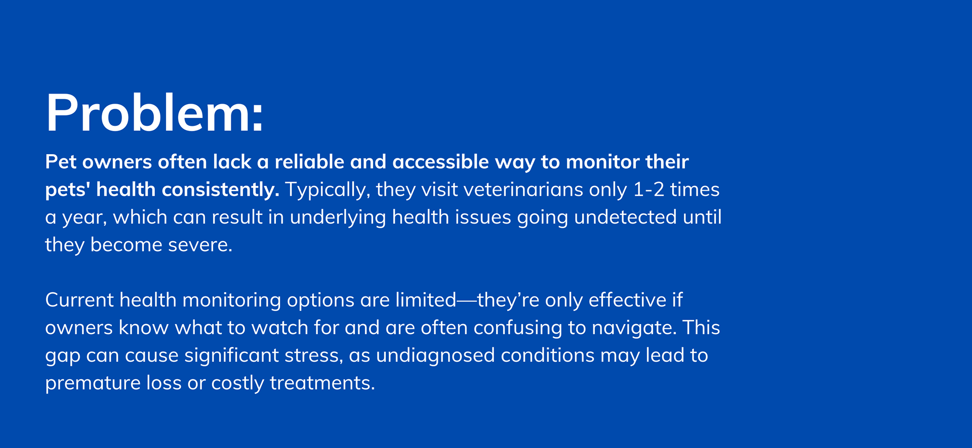
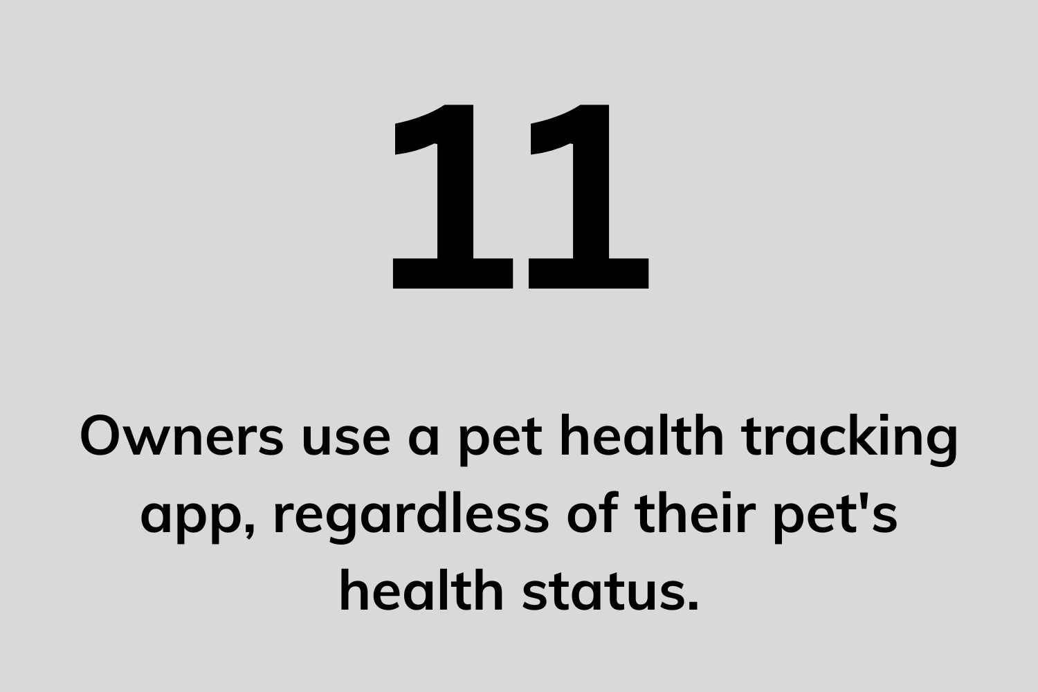
Before beginning the design process, I needed a deeper understanding of the challenges pet owners face in caring for their animals. To gather this context, I conducted interviews, surveys, and a competitive analysis. I interviewed 13 cat and dog owners and received 5 survey responses, totaling 18 participants.
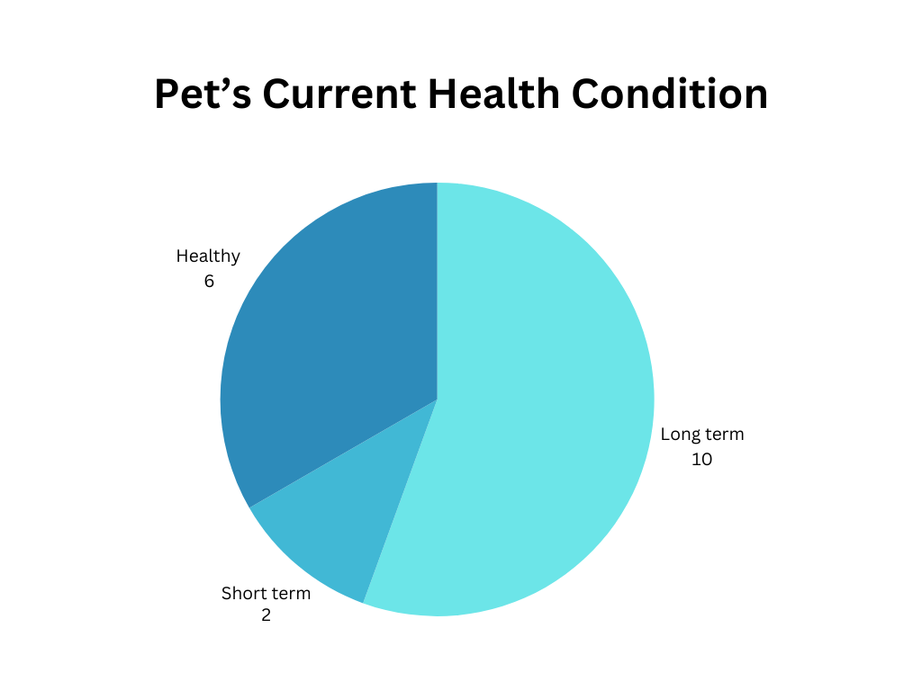
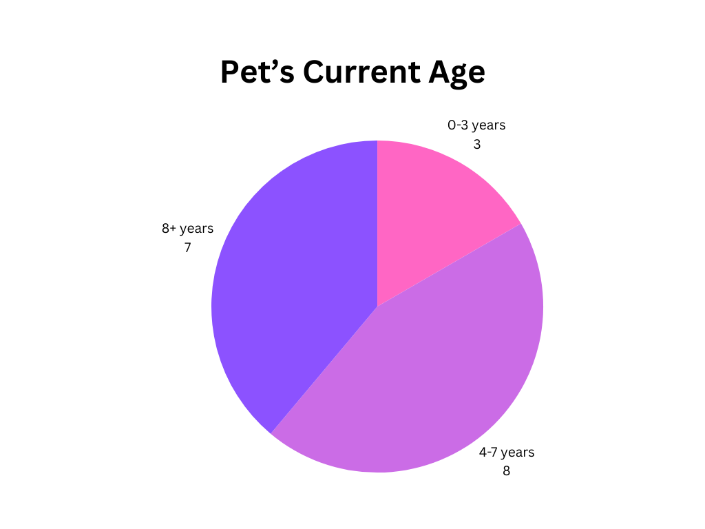
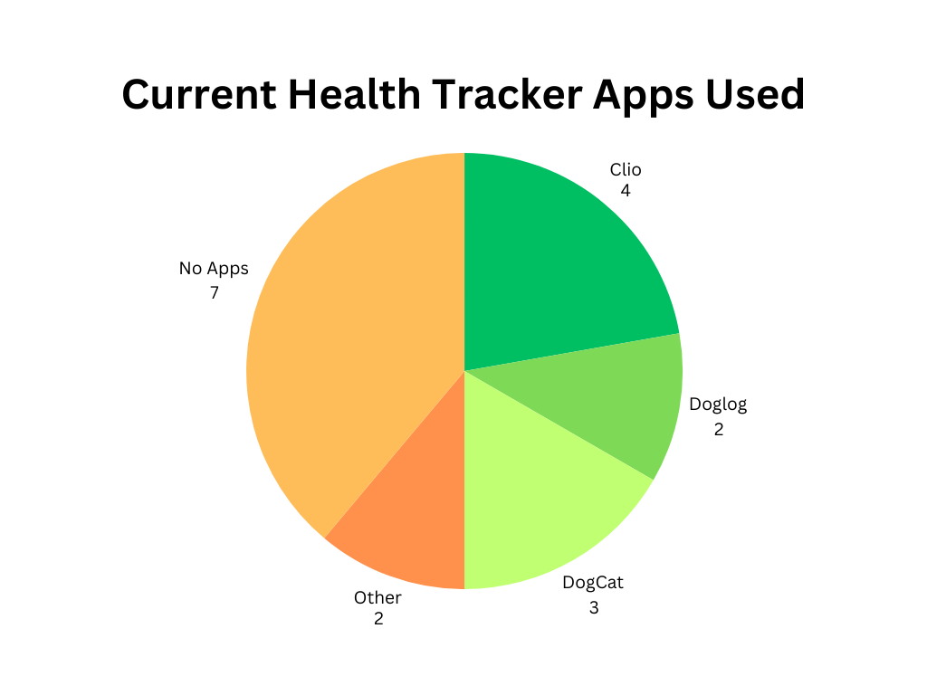
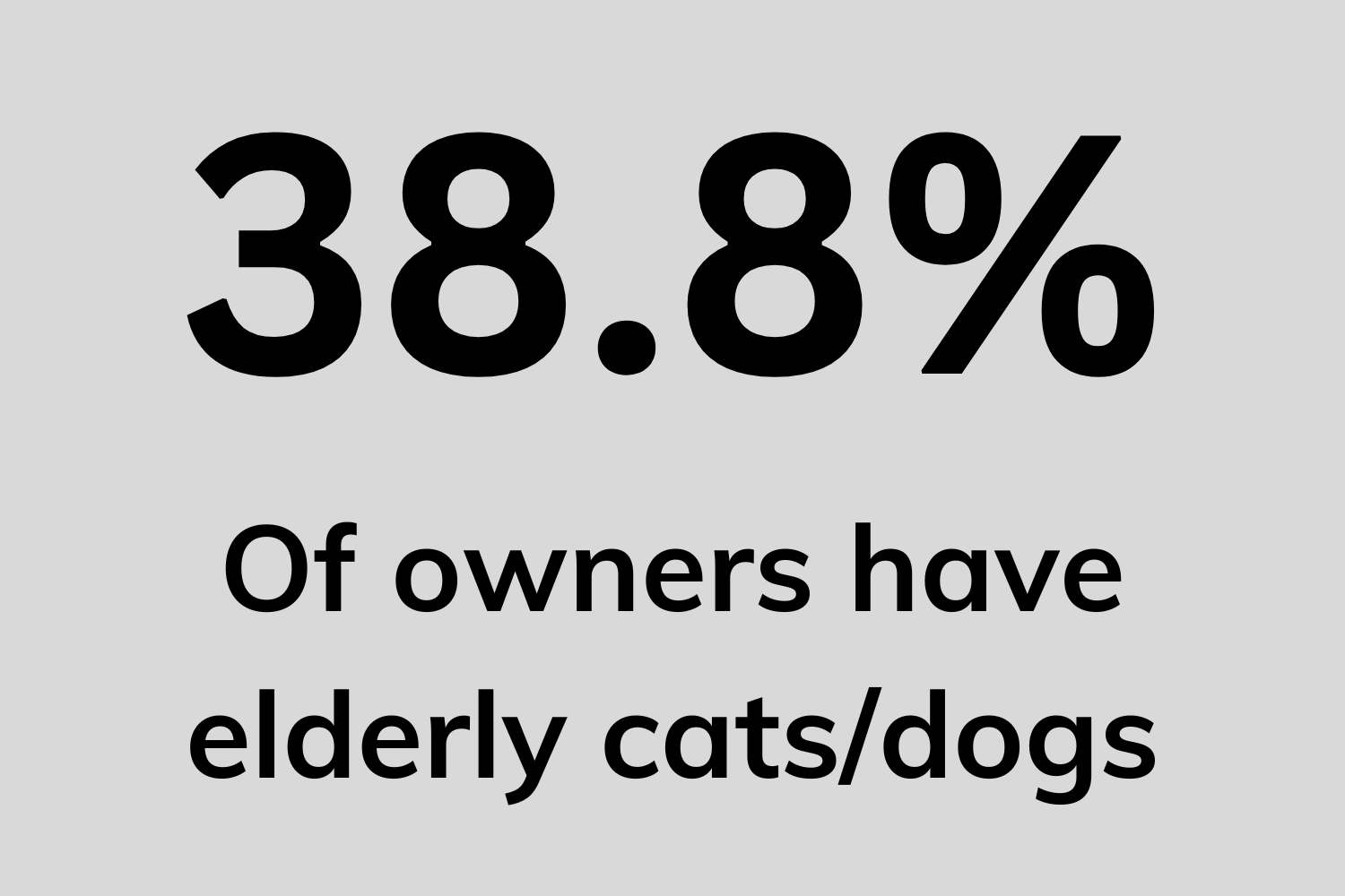
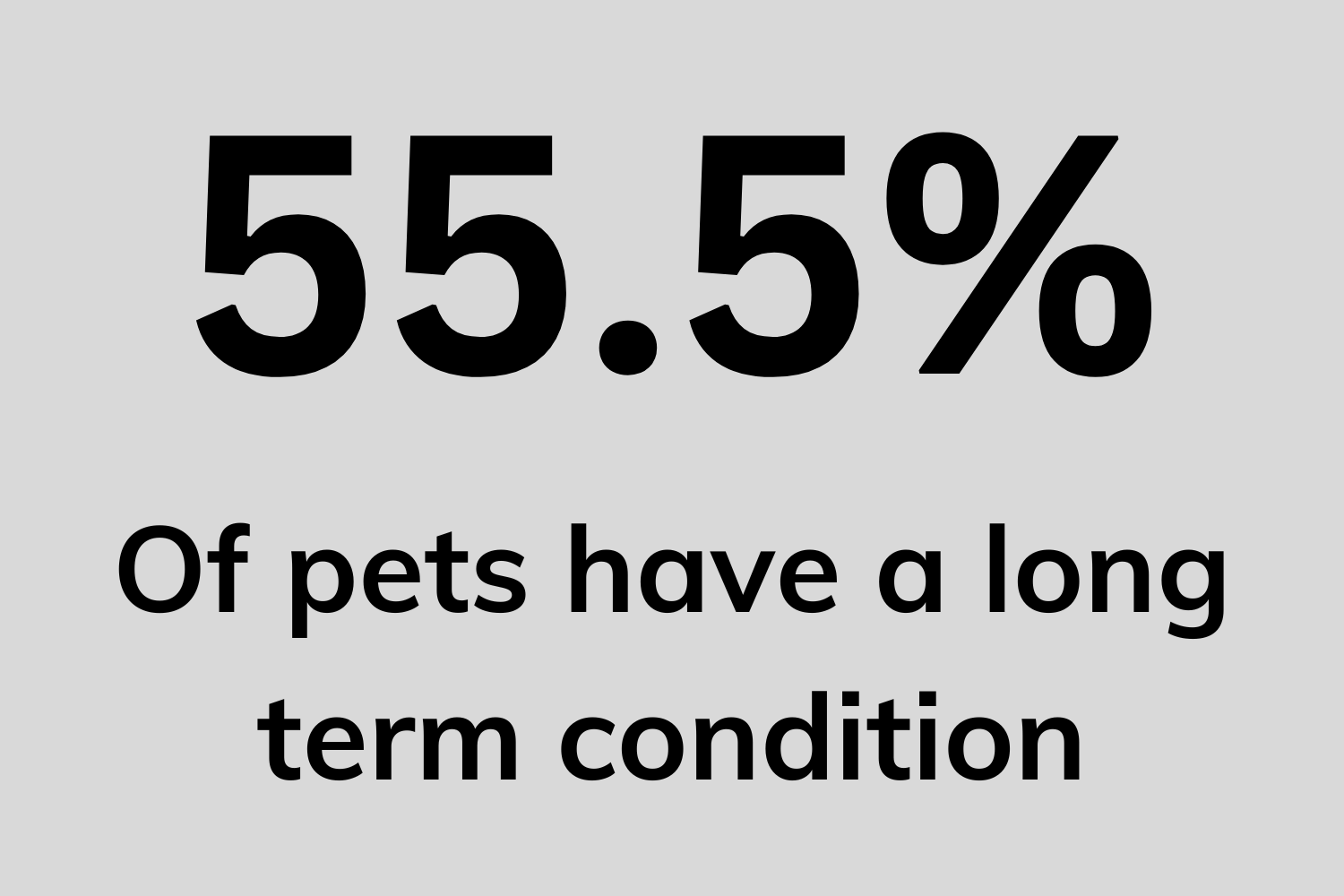
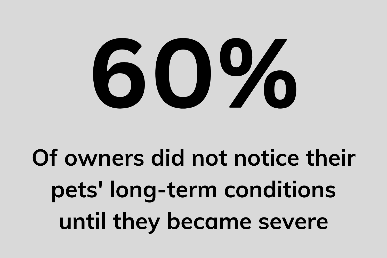
Through these sessions, I gathered insights into their pets, current health concerns, and the apps they use (if any) to support their pet care routines.
Sample Questions:
How old is your pet?
Does your pet have any known health conditions?
Do you currently use any apps or devices to monitor your pet’s health? If yes, which ones?
How satisfied are you with these tools, and what improvements would you like to see?
How often do you take your pet to the veterinarian?
What are your main concerns regarding your pet’s health?
Sample Quotes:
"My cats seem healthy, but they’re so tough that it’s hard to tell anything’s wrong until the symptoms are really obvious—or unless I get them checked often."
"I didn’t even realize my cat’s kidneys were failing until it was too late."
"My dog’s healthy, but he’s getting older, and that worries me sometimes."
"It’s hard to know what’s wrong with a pet unless they’re showing really obvious symptoms."
Competitive Analysis:
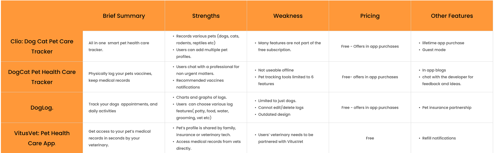
Following the interviews and surveys, I began researching popular pet health-tracking apps to gain insight into the current market, their functionalities, and opportunities for differentiation.
I incorporated user feedback from the interviews to guide my analysis and identify areas where my app could offer unique value.
Sample Quotes:
"I’m using DogLog right now. It works fine, but it’s super annoying that I can’t edit any of my logs."
"I’ve tried a few of those tracking apps. They’re helpful, but I always forget to enter the updates."
"I like Clio, but there’s just so much going on. It can get really confusing."
"Honestly, Clio is the best one out there."
Persona:
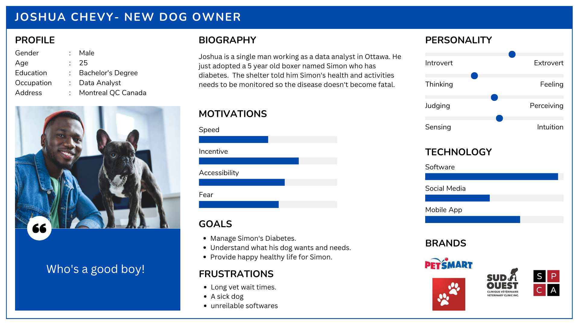
Based on the research data, I developed a persona to represent the target end user. This persona serves as a visual and empathetic tool to keep the user experience centered around the needs of pet owners tasked with monitoring their pet’s health.
By anchoring the project to this persona, I ensure that the design choices remain user-focused throughout the entire process, capturing the story and challenges of a pet owner committed to their animal’s well-being.
User Flow, App Flow, & User Journey:
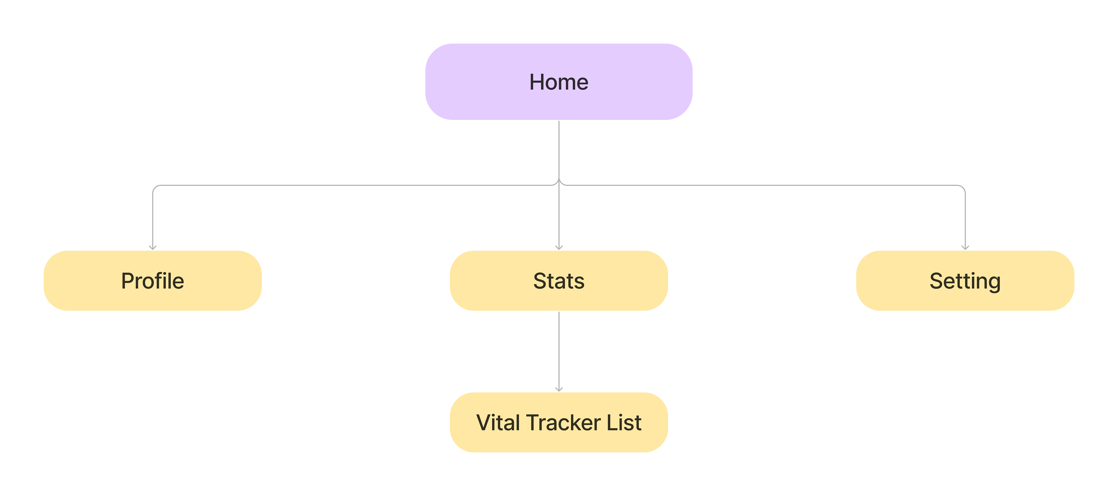
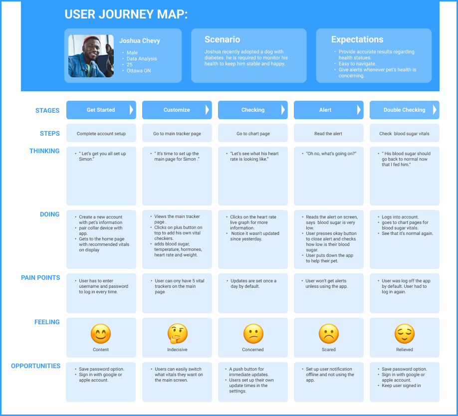
The first step in developing the app is creating a flowchart to outline how it will function. This helps organize the overall structure and navigation. Additionally, I developed a user flow and a user journey map to provide a visual representation of the user’s perspective and interactions with the app.

Medium Fidelity Wireframes:
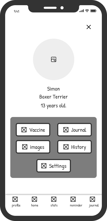
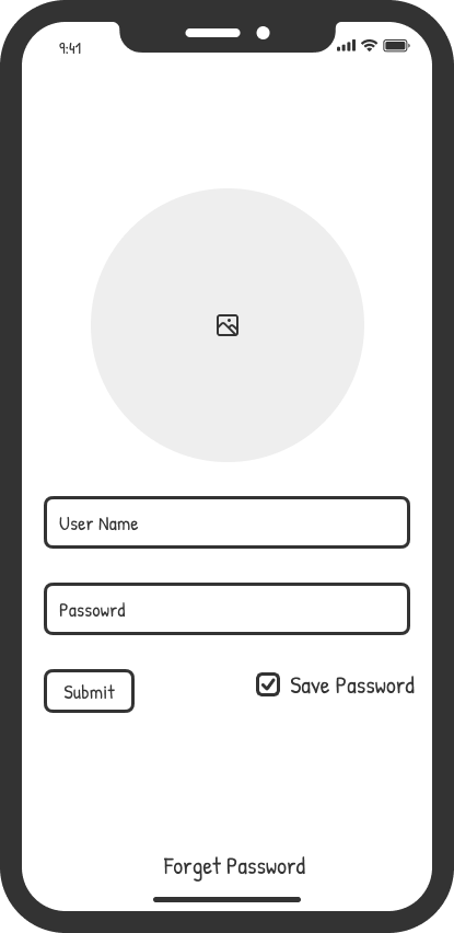
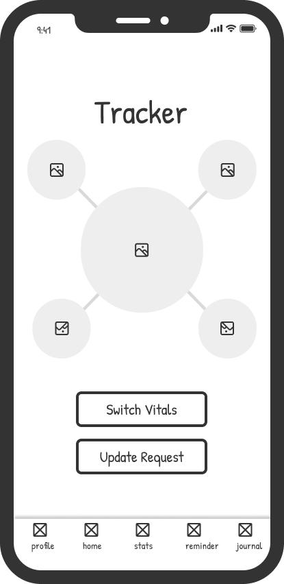
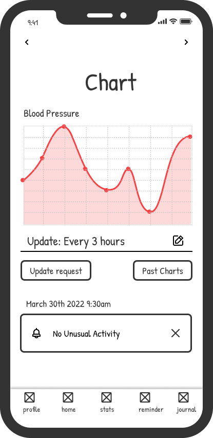
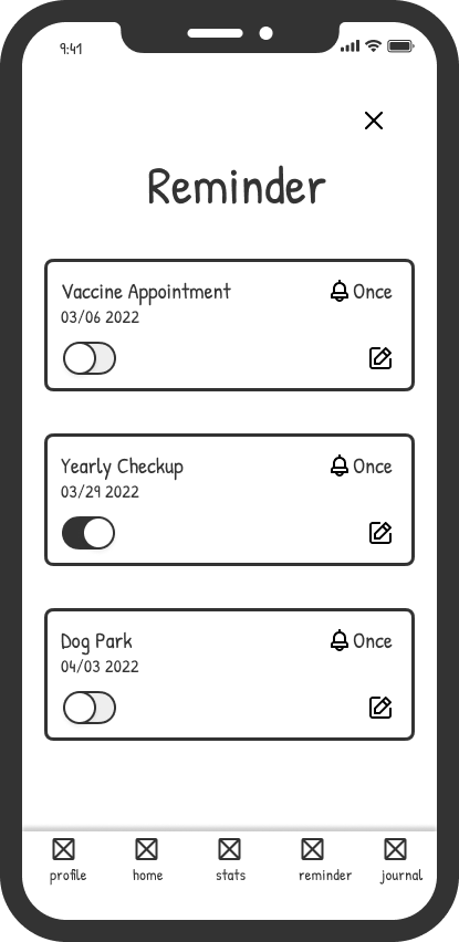
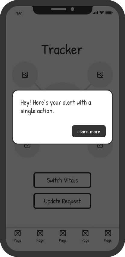
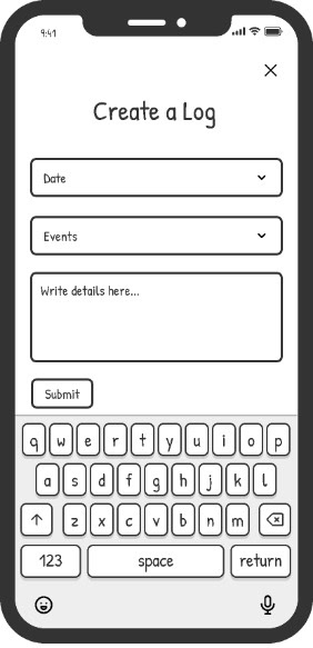
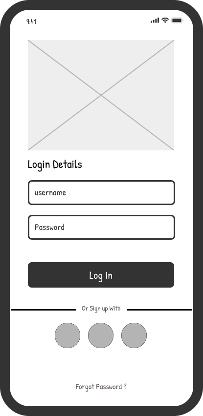
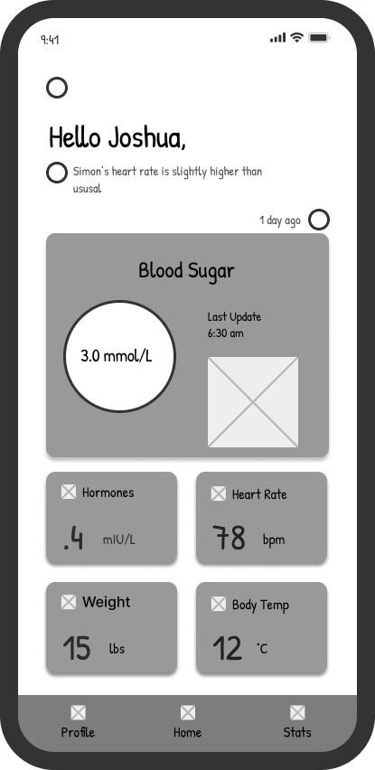
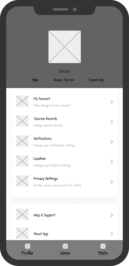
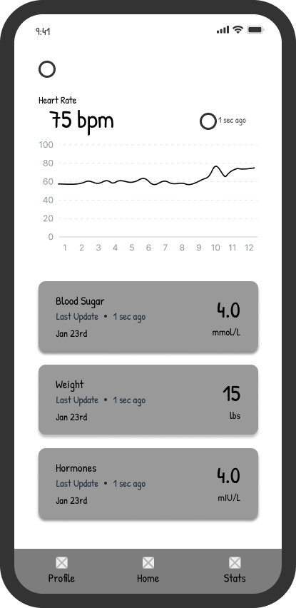
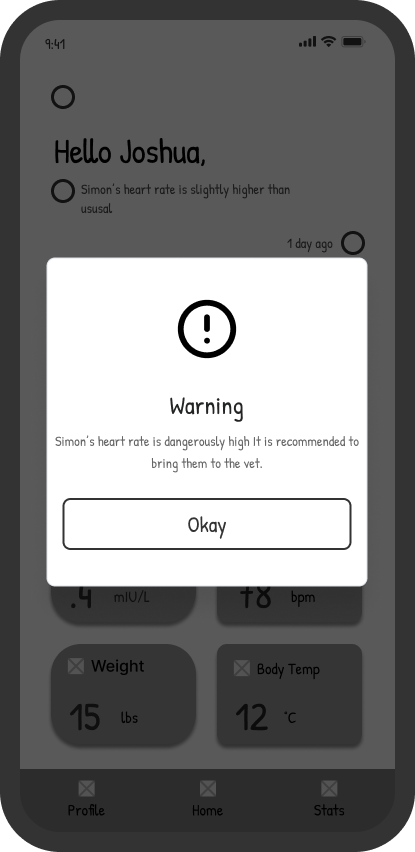
I've transitioned from initial sketches to a medium-fidelity wireframe. This wireframe serves as an effective tool for accurately showcasing the layout and providing a preliminary look at the final design.
By using it for user testing, I can gather feedback and make adjustments swiftly and efficiently before moving on to the high-fidelity stage.
This approach ensures that any necessary changes can be implemented early in the design process, streamlining development and enhancing user experience outcomes.
User Testing:
The next step in this project involves testing how users interact with the app to identify any usability issues with its navigation and core features. My goal was to gather actionable feedback on enhancing usability. To do this, I set up testing using Maze, involving 15 participants.
Each participant was assigned four tasks to complete, allowing me to observe their interactions and uncover any pain points or areas needing improvement. This testing phase is critical in refining the app’s design for a more intuitive and seamless user experience.
Tasks:
1. Sign in to account and check chart
2. Go to log page
3. Go to reminders
Results:
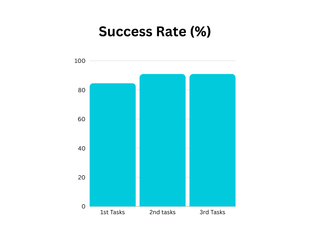
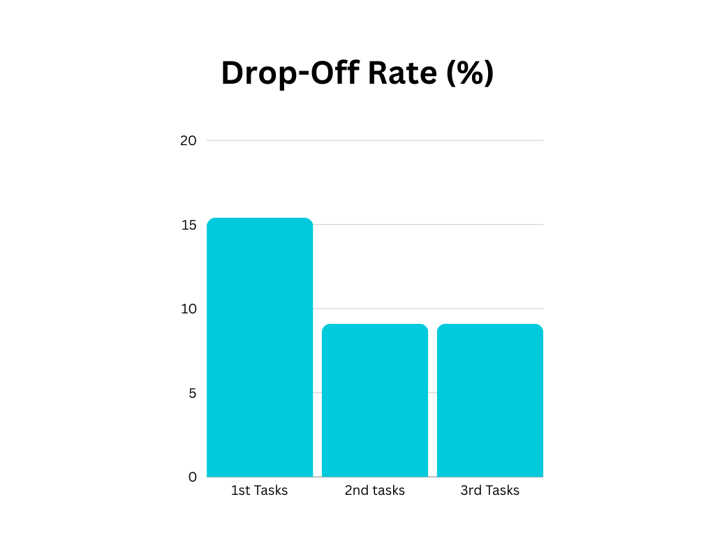
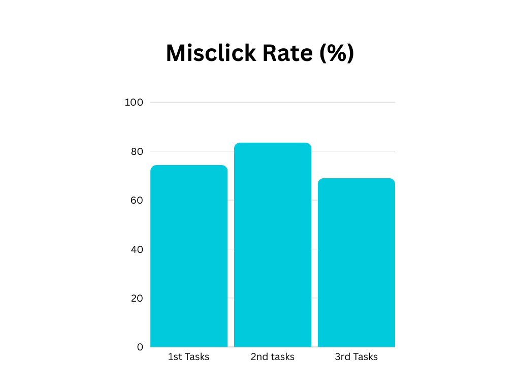
The user testing results revealed more challenges than expected. While most users completed the tasks, many did not follow the intended navigation path.
The first task posed the most difficulty. Although participants successfully logged in, they struggled to navigate to the chart page( with a few leaving the testing). This suggested that the main tracker and navigation setup are not as intuitive as anticipated, leading to confusion.
For the second task, I observed a similar issue. Many users tried accessing the log page from within the profile section rather than through the navigation menu, as intended.
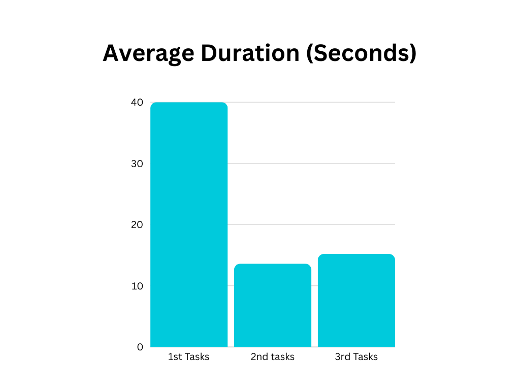
This deviation indicates that the design of the navigation hierarchy and labeling may need refinement to align with user expectations. Additionally, participants took longer than anticipated to complete each task, signaling room for improvement in streamlining task flows and enhancing ease of use.
Sample Quotes:
“I don't like how the main page looks.”
“Having the log page on the navigation and in the profile page is too confusing.”
“The journal page is kind of pointless.”
Main Page Layout: Users felt that the main page layout was neither visually appealing nor intuitive, impacting their initial impression and ease of navigation.
Log Page Placement: The log page’s presence in both the navigation menu and the profile page caused confusion, with users unsure of the intended access point. This suggests the need for clearer, more consistent navigation.
Journal and Reminder Pages: Some features, like the journal and reminder pages, were not well-received. Participants didn’t see the value in the journal page, indicating it might need reworking or a clearer explanation of its purpose.
This feedback will help guide updates to simplify navigation, enhance the main layout, and reassess feature relevance to improve user engagement and usability.
Changes:
Using the data and feedback from user testing, I implemented several key design changes. First, I completely revamped the main page, chart page, and navigation to create a more intuitive experience. Additionally, I removed features that users found unhelpful, including the notes and reminder pages, which were not adding value to their overall experience. These updates aim to streamline the app, making it easier to navigate and more aligned with user needs.
Final Results:
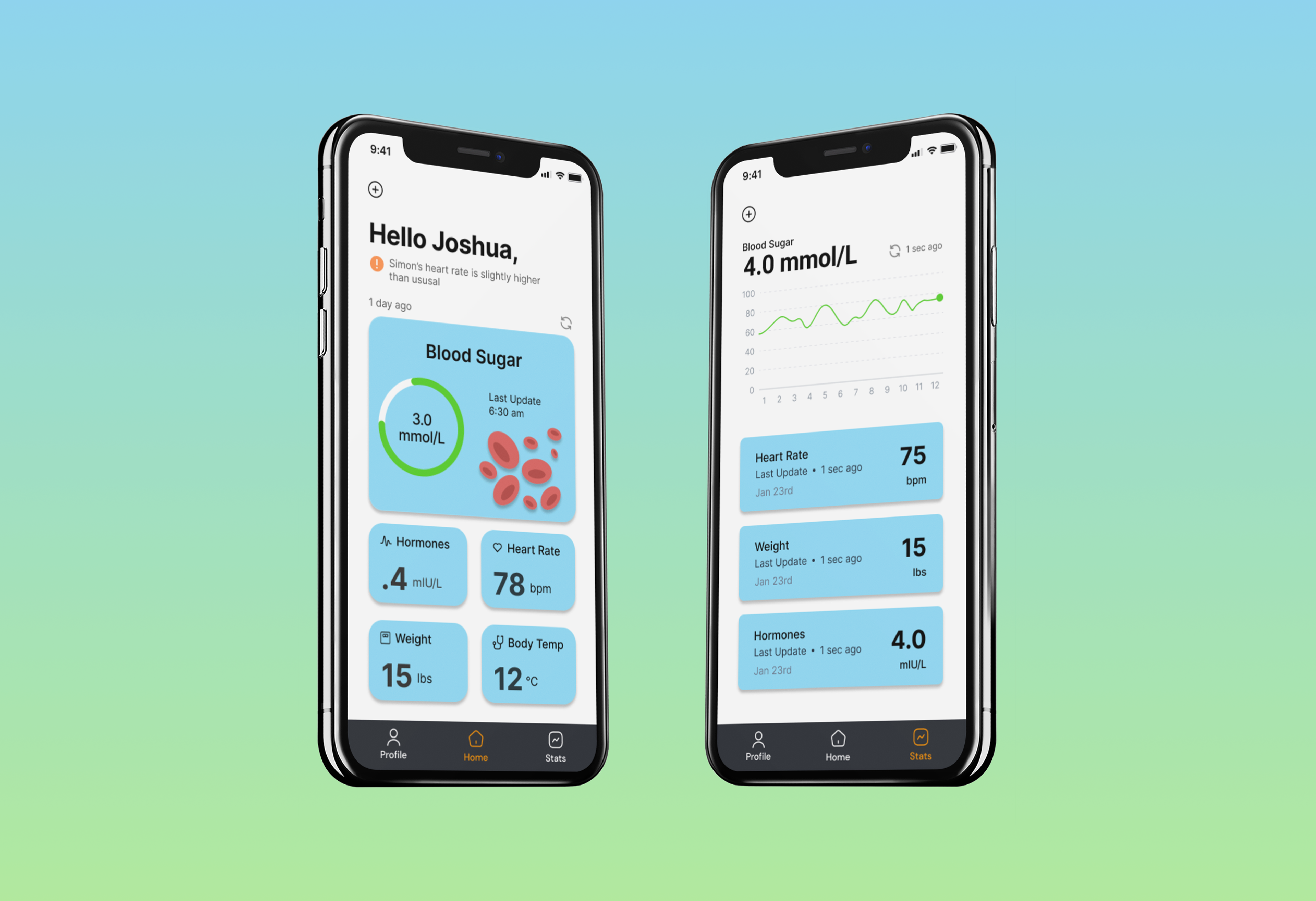
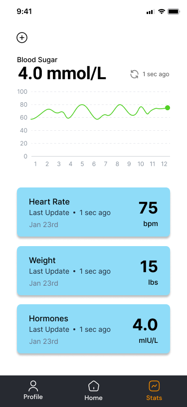
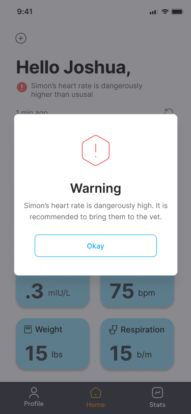
After receiving positive feedback on the recent improvements, I moved forward with developing a high-fidelity version of the app. I also created a video walkthrough showcasing how each feature works to provide a clear, interactive demonstration of the updated design.
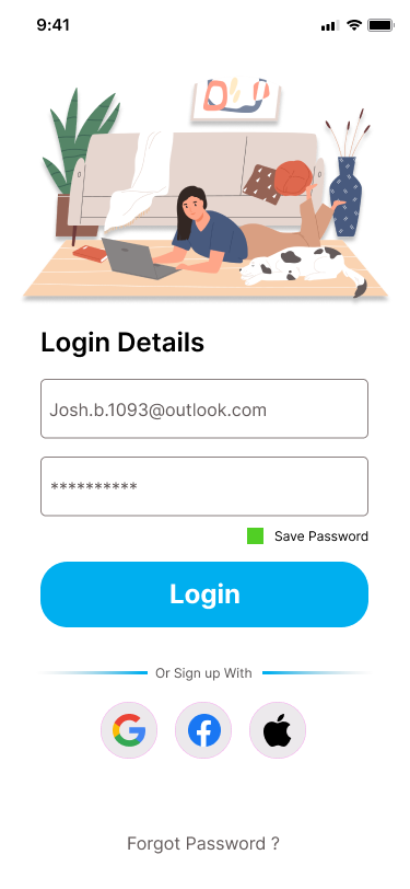
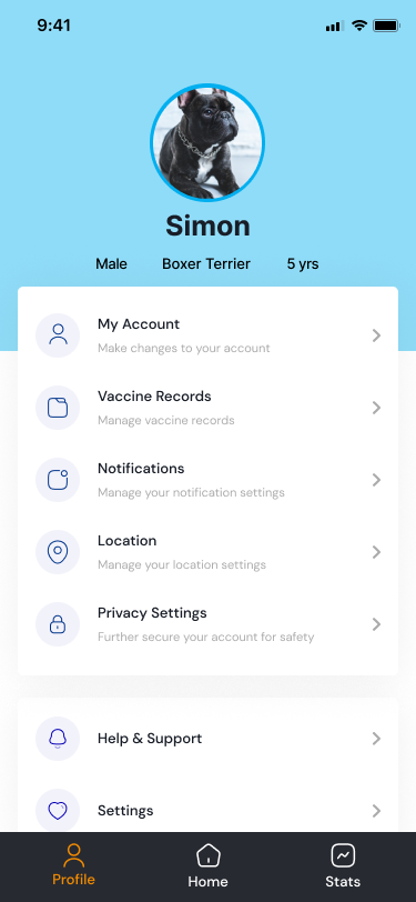
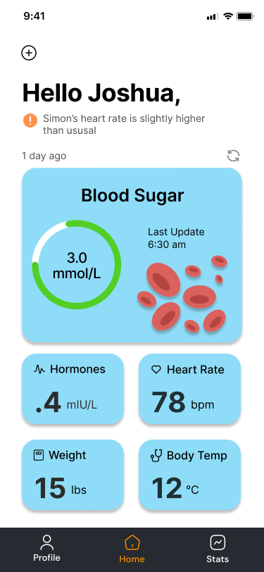
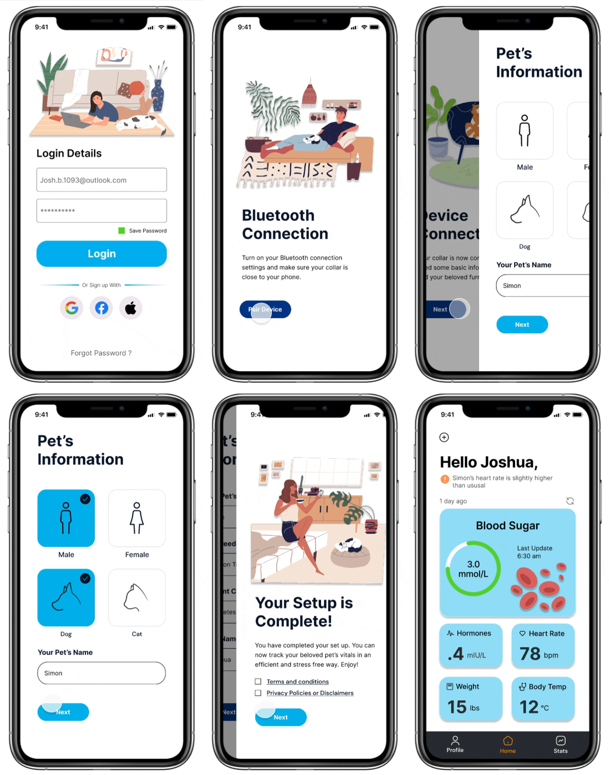
Setting Up Profle
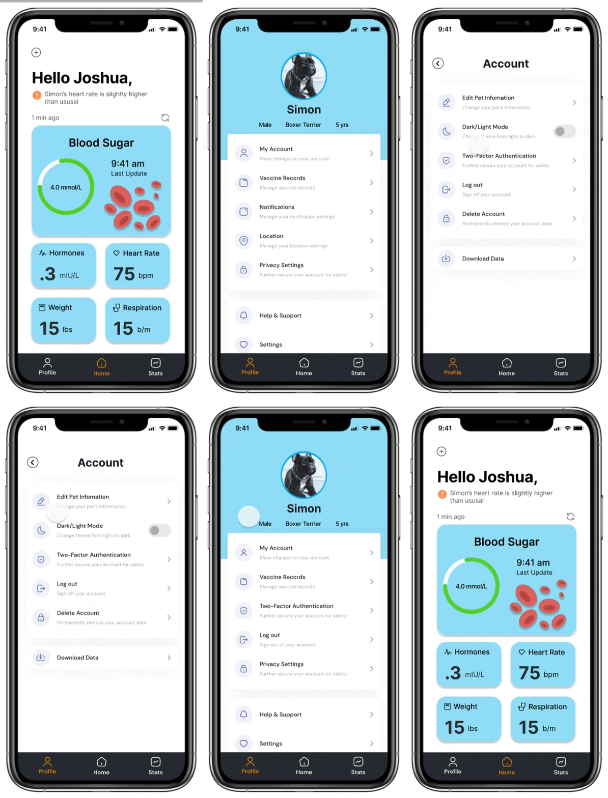
Profile Page
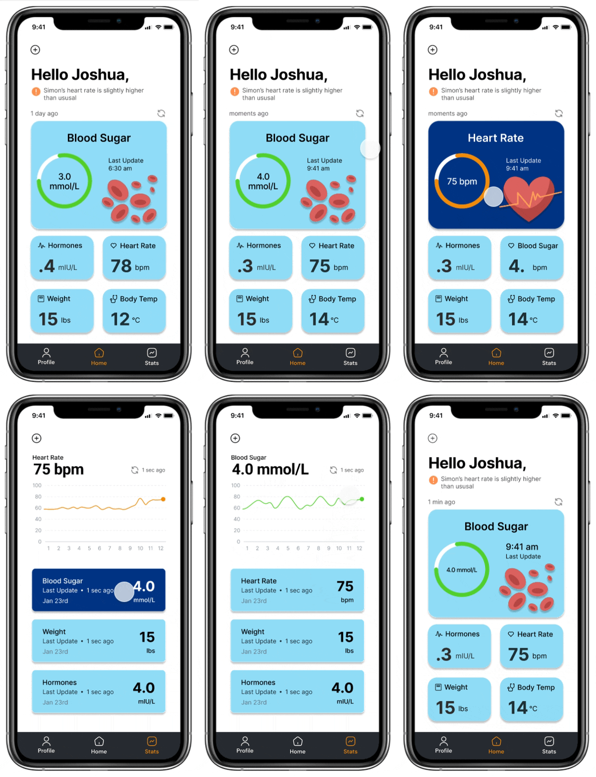
Stats Page
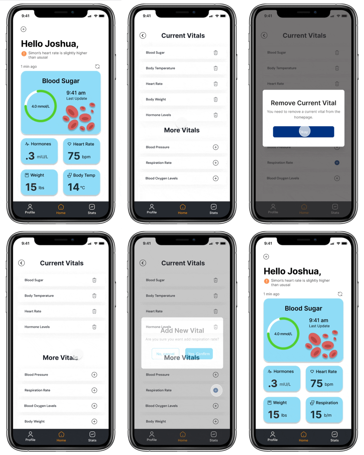
Change Vtials
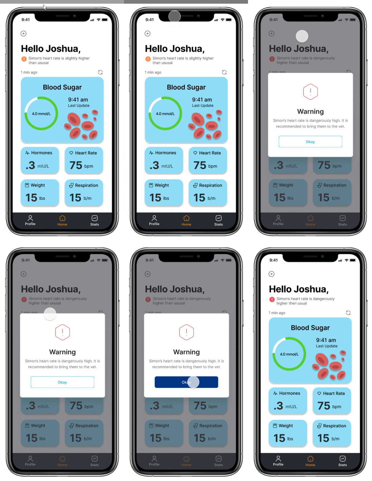
Alert Page
What I learned:
For future projects, I learned that I could have prevented the challenges from the first testing round by starting with an ideation exercise. Involving participants early on to gather insights about what they’d want in an app would have set a better foundation.
Additionally, I would conduct a second testing round as thorough as the first to gather more precise, actionable feedback instead of relying solely on general impressions. This approach would ensure that the design is fine-tuned to meet user expectations and functionality needs.